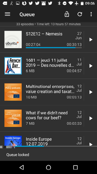
Whover is interested in open source and happens to listen to podcasts, might have heard of podcast manager AntennaPod. Important element of the app is the queue, where downloaded episodes are listed - queued - for playback. This queue can be reordered manually, but there also is a button that ‘locks’ the queue to prevent accidentally mixing up the queue.
The issue: many people aren’t aware of this possibility or don’t understand how it works. We’re thinking now in the GitHub issue, therefore, how we an improve this queue manual-sorting experience for users: How do we allow users to drag items, without making it too easy (to prevent accidental changes) and while providing visual queues to the user, without cluttering the interface? (Long-press is currently used to launch a context menu & can’t be used for moving items unless the context menu gets its own button.)
Do you know of other apps with such a ‘queue’? Would it be safe to remove visual queues indicating the possibility to move? Are there any interaction patterns that we should be aware of? Do you have a one-in-all solution? It’s a challenging issue, and I’d be interested to hear your thoughts!
Hah, I like that. It could also be combined then together with the batch-edit functionality that exists. Combining the two edits behind one button (I could even imagine it being a pencil) would allow drag = move position, and tap = select for multi-episode-edit.
I’ve referenced your suggestion in the AntennaPod thread. Thanks for the quick reaction & your proposal!
If anyone knows of drag-and-drop in existing apps, I’d be interesting to hear also
I don’t have anything to add on the design side of things except I’d never heard of this app before and now I’m going to check it out! I’m a huge fan of the UI for BeyondPod but sadly they were purchased by a company in 2016 and ever since then their performance and bug fixes have gone down the tube. Hoping you guys have a similar UI!
I wonder – are accidental changes actually a big problem? Looking through antenna pods issue tracker, I could not find any people complaining about accidental moves. If this would be likely to happen I would expect people file issues there. Unlocked is the default mode, so people have plenty of opportunities for accidental moving, if that would be a thing.
Also, moving is usually risk free: If you accidentally moved something, you can move it back.
So, one way might be to just not have a lock mode, since modes are problematic as shown by the amount of issues on people being unable to move items. I would strongly recommend to get rid of the mode; it is not a problem of the icon.
As a possible example to look at:Vanilla Music (Android, Open Source) has a drag-and-drop UI for reordering tracks in their playlist and a swipe-to-uncue (delete from list. See also some examples of swipe to remove). Thus, removing is harder to do (needs a swipe). If it should happen accidentally: as it is just the play cue, you can just re-add the file.