Role: UI / Usability
Skills:
This is a companion discussion topic for the original entry at https://opensourcedesign.net/jobs/jobs/2019-12-06-rework-the-search-and-replace-dialog
Role: UI / Usability
Skills:
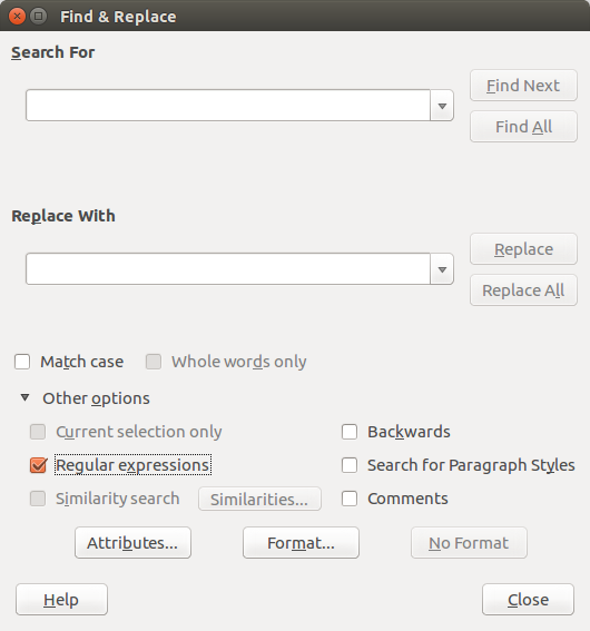
FYI, the dialog is this one:
Other products:
InDesign has a simple search/replace text input with “Whole words” and “Ignore Case” option and and an extended mode where you unfold two lists to which you can add formatting options: Search formatting and replace formatting
QuarkXPress (or my old version of it) does a mix of Scribus and InDesign: They hide the formatting search and replace options and show them when you unselect “ignore formatting” which then results in a search replace dialog similar to Scribus’
Libre Office allows only to search for formatting. The formatting is defined via their normal formatting dialog, so there is no easy overview of what you selected.
Looking at the dialog and the ways that other solutions work – would it be an option to have the text options in the normal view, and, upon click on “more options” or whatever show all the formatting search/replace options?
This, I guess would not be too far from what is there now, it is usability wise one of the most standard/obivous solutions and it would be not too different from what QuarkXPress is/was doing in its basic idea (which makes me confident that it is not stupid to go this route)
hi jan,
thanks for caring!
during my refactoring i got tempted to change a little bit the layout and this is what i came up with:
pretty close to what you are suggesting : - )
ASAP, i will layout the bottom buttons as you are suggesting.
concerning the “more / less” button i’m not 100% sure that i want to make the change right now.
on the one side, i’d prefer to wait for some UX person to go over the dialog as a whole and including the feature that are likely to be added in the near future.
on the other side, it’s easy to add the button and remove when we have a new concept…
since it took so long for my posting to get through the pipes, i’ve asked in a different place too and we now have a WIP document summarizing the “search and replace” re-design.
(i wanted to upload a pdf snapshot, but i’m not allowed to upload it here)
i can share the address of the editable document with interested people (but i prefer not to put it in here, since it’s not under revision control (yet))
I think adding that button is relatively risk free. It is a core element of the suggestion in my mockup, since it allows to split the UI into two parts that can be (at least in some sense) be tackled separately:
So you could for now improve the usability with just the show more/show less button (or an equivalent control that shows/hides the additional functions, though I guess the one I suggested would be the most common thing to do in desktop applications). Even if then someone reworks the special options, you would only need to change this part.
However, given that the current UI for formatting search/replace is imho better than LibreOffice’s, similar to Quark’s and only a bit less flexible than InDesign’s, I guess it is in a good shape.
This looks interesting to work upon. I’m new to this community. Let me know how can I be a part of this.
jan, you were almost right that it’s easy to add.
sadly, getting the dialog to shrink was rather painful (it’s only two lines of code but i only found the correct lines in a StackOverflow comment linking to a blog post from 10 years ago… and that only after a couple of hours of wild tries).
but it’s now in!
i agree that the checkboxes are ok, but if we add more of them (and generally more options) it might become too much.
i’ve only seen a screencast of ID and i did not really like what i saw.
i don’t really like that part in libre office either.
if possible, i’d like to avoid pop ups.
for this first step, i will not change the UI anymore (in a radical way), but i welcome future improvements.
(this first step = getting this complete rework submitted to the scribus bug tracker and reviewed by the team)
i will find a way to publish the current state of the UI document and send you and meet the link to the collaborative editor.
That looks good! Pity that it was hard to add.
I still think what a good label on the button for more/less of the options would be, “more…”/“less…” is a bit nondescript (and the “…”-particle hints to “more” already). “Attributes…” or “Format…” would be my suggestions – they help users to guess correctly what they get when they click the button.
the goal of the current patch is to add the capability to search and replace across multiple frames.
i’ve already spent lot of time on it and the dialog already improved a lot. even if i did not really want to work on the UI.
i need to move over and wait for somebody from the scribus team to review the first patch.
i’d prefer to keep further refinements for a second step, where we will then propose a UI that takes into consideration a few other features that are to be added.
about the specific matter: i fully agree that more and less are not really good. but i think i tend to prefer a (v) (^) button to a longer or more descriptive label. except if we end up having multiple “more” buttons…
i hope you don’t mind, but it’s christmas time and i have to bake cookies : - )


