Role: UI/UX design
Skills:
This is a companion discussion topic for the original entry at https://opensourcedesign.net/jobs/jobs/2021-04-24-
Role: UI/UX design
Skills:
Hello! Has this position been filled?
Note: I’ll email this to the given email ID, but I did draft this here, so I might as well share it for everyone’s benefit.
Before I start, I’m running version 1.10 on Ubuntu, so my feedback may be outdated. I’ll eventually follow the guide and install the latest version, but it’s quite daunting for now.
Personally, I think qute looks good enough as it is, even if I’m thinking about changing the theme to my own. The whole point of the browser is to stay out of your way, and I believe it does that pretty well. If you want to change the base theme, I’d personally go with all black, or as much as possible :D
My biggest issue has been with tinkering around and configuring stuff–I’ve done a bit here and there, but for the most part I’ve stuck to the default features, perhaps also because they’ve been enough for me.
I believe most of the effort should go towards a website redesign and improved documentation. For one, the keybinding cheat sheet is an image, so you can’t perform a quick search to find the key binding you’re looking for–a simple table of keys and their functions might be more useful. Additionally, the page highlighted in the navigation bar isn’t the page that you click, but instead it’s always the donation button. Immediately, you have no context for where you are on the website, and you have to look at the url or the page content to figure it out.
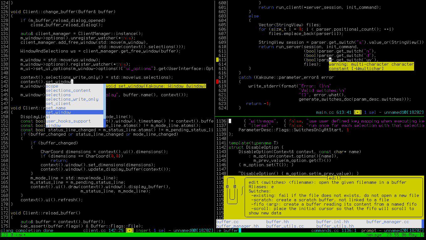
Another help in discoverability would be better autocompletion in the command mode and a sort of documentation where you need it–for example, if I’m using the :open command, it can show me a hint with the parameters accepted by the command (see the bottom right window in http://kakoune.org/img/screenshots/screenshot-tmux.gif for an example, which shows interactive help for the command being typed).
I also had some issues with some of the prompts–the final actions to say yes, no, etc don’t have clickable buttons.
To conclude, most of the work should be done with the website and documentation, with incremental adjustments to the UI/UX of the software itself. The theme is quite alright as it is.
Sorry everyone for the long delay! I was busy with some other things over the last couple of weeks, so it took me a while to answer here.
@Swetha00 The position is still open for now. There were already various very interesting applications, and I currently plan to discuss with some other people and pick someone in early July.
@pruhnab Thanks for this very insightful analysis, much appreciated! Let me answer publicly as well, to also provide a couple of more details about my thoughts.
I think there weren’t many changes related to your comments, but I’m not entirely sure, given that v1.1 is almost 3.5 years old now.
There are detailed instructions for getting a local installation of the most recent version, without having to mess with anything system-wide. If there’s something that could be improved or clarified in those instructions, I’d be all ears!
Yeah, I’m mainly looking for small changes and nothing fancy. Agreed that the UI should mostly stay out of the way. Still, I’ve heard that the default appearance feels somewhat dated somehow, and after changing a couple of things in my own config (at the left), I tend to agree:
Configuring is another area where there’s extensive documentation, but maybe that’s not as easy to find as it should be. More about that below.
Agreed. A blocker for that is switching to different tooling for the website and docs, which is something I’ve wanted to do for years now. I hope I’ll get to pick it up somewhen soon again, because I’d definitely like some more structured documentation indeed.
Unfortunately, it’s entangled with various different things (like some documentation being generated from code in a custom way and such), and also needs someone to create a design (or adjust the existing one) for the new website/docs with the new tooling (Sphinx).
Solving the design part of that is also why I also opened a second job posting for web design, with no answers so far. However, I saw some applicants for the UX/UI position who also do web design work, so I’ll reach out to those in the hope I’ll find someone.
I think both are needed! From the feedback I got, many users really like the cheatsheet format. However, you can run :bind to get an overview of all bindings, or look at the third column of the completion:
If you have more ideas on how to make this discoverable, let me know!
Yeah, that’s probably mostly a tooling thing again. With the current tooling (asciidoc and some hacks on top) this isn’t really possible easily, but I hope that’s something we can fix with the tooling change and redesign.
Agreed! We already have completion for a lot of things (see e.g. :set), but having proper completion for flags is something nobody took up yet. Similarly, there’s an issue open to show the allowed syntax for commands while typing them. I added a comment with the Kakoune screenshot there.
Those are there to show you the associated keybindings. In many areas of qutebrowser, mouse usability is kind of a second-class citizen.
While this probably isn’t a priority, I think it’s a good idea to allow for some more (optional) mouse usage where this makes sense, and I think it definitely does in your example. I added a comment to a very similar issue:
Make the completion usable with the mouse · Issue #2159 · qutebrowser/qutebrowser
Thanks again for all the valuable feedback! ![]()

