Disclaimer: I have zero skills regarding design, feel free to contradict whatever I write
We have a nice Enough logo and trying to adapt it for NextCloud and favicon.ico. I naively resized it but … the result is not good as you can see below:
I tried to include the logo in a white circle and it looks a little better:
I’ll keep experimenting and would be very happy if someone has advices on how to improve the situation. The next step will be to design stickers
Hi @dachary
I saw your request and attached are the following. Enough logo Favicon Zip - I made the three major sizes:
16x16:
32x32:
96x96:
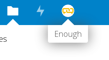
NextCloud Enough logo adaption - I’m happy to try more iterations but I didn’t think the white circle sat well with the others. Ideally it needs to fit the design language already in place. So I pulled one of the drawable resources in your images from Github (activity) and made sure it would sit centered next to the rest. I chose on the lighter blue color and would suggest you use the logo’s main yellow color (#F1C119) as the rollover state.
main state:
rollover state:
I hope this helps, and please let me know if there are any problems with the files or changes you’d like, I’m happy to revisit. Also where should I upload the original .AI files so you have them on record?
Let me know what you need re- stickers.!
Thanks
Dina
To be honest I’m not sure @veronika and I kind of like the 2.5cm x 2.5cm sticker size. And I like round stickers. Maybe the logo in a circle with the enough name under it? Here is a poorly executed example of what I mean:
@dmichl The NextCloud SVG is now properly centered However NextCloud needs a white logo on a transparent background instead of two (one for when the user hovers and one when they do not). I tried changing the slight blue to white with inkscape but when I save as SVG it becomes entirely transparent: I’m not very skilled at this (to say the least ;-). Would you be so kind as to show me the way?
The resized square PNG files with the logo are exactly one pixel larger than the size in the name of the file (16x16 is 17x17 etc.). That made me curious to know why this is necessary?
They do! I added all SVG variations (yellow & white + square & rectangular) you provided to the artwork repository.
You were added to the Enough hall of fame so other members of the community know about your contribution. If you do not want to be listed, please let me know.
Hey @dachary below are my suggestions for stickers. Please also consider the following when discussing with your colleagues and reaching your decision:
The Enough logo that was designed is already very complex, so I believe that it is best to keep it simple/straight forward as far as the stickers go.
Either choose the sticker with the logotype A1 or choose the logo symbol on its own in an octagonal sticker shape B1 (my preference) in the logo’s primary yellow color. I’m not sure if you’ve heard of http://hexb.in/ but they are the ones that a lot of tech companies (like the EFF) and I love the look/feel of them. I think it fits your brand better too…
If you are uncomfortable having the logo symbol stand on its own you could add a small note about nextcloud. I believe it’s affiliate with nextclound right? & and NextCloud’s style guide says you can use OpenSans. This avoids repeating the logo twice like your example. NextCloud in small will help anchor people if they don’t know the product and want to know more. I do not recommend adding the word enough in new typeface, as this will confuse and create a new logo. Unnecessary.
Of course it’s your decision, which is why i included so many color suggestions .
Please let me know what you want to move forward with and if you agree B1 is the one to “print”, I will create a separate file for you and upload.
Thanks
Dina
Very nice It could not arrive at a better moment: I’m sitting next to @veronika and we discussed your designs in person. I showed her the design before she got a chance to read your message and … B1 has her preference. Let’s go for B1 then!
Although Enough is based on NextCloud at the technical level, it is a different project which has its own website. You are right: having the Enough name with the logo included would be too heavy. It would be nice to have the name though. What about Enough instead of nextcloud?
I understand your thinking but I wouldn’t recommend it. If you decide to go with the 2.5cm/3cm stickers, the type will be small and i think visually it won’t have the same weight/sway as it would without it. I’ve looked at a lot of stickers logos and pretty much no one lists the name with their symbol. I believe that your audience who will receive your stickers will be familiar with your brand/product and it’s a nice conversation piece if it’s on someone’s laptop.
I’ve given your request a lot of thought and came up with an alternative suggestion. You could use the URL instead, enough.community is also much stronger than just “enough”. I still prefer A (just the logo) but also like the look/feel/tension of D.
Please see below and let me know what you and @veronika think and I’ll upload the final .svg for you to proceed.
Wonderful, and my pleasure!! i’ve already uploaded the .svg for you - take a look and let me know if that satisfies what you need. Happy to send you the original .ai file if that helps or anything else.


 However NextCloud needs a white logo on a transparent background instead of two (one for when the user hovers and one when they do not). I tried changing the slight blue to white with inkscape but when I save as SVG it becomes entirely transparent: I’m not very skilled at this (to say the least ;-). Would you be so kind as to show me the way?
